Xfce 4.12 after almost three years
|
User Directory Confusion
There was a brief moment of concern among users when Schermer announced that the classic user directory would disappear from the display in Thunar for Xfce 4.12. The announcement is somewhat strange and initially also confusing. Thunar users have become accustomed to finding the file tree to the left and their personal directory as the first entry. The entries that follow are for things like a connected storage device or network device and trash.
This all looks different in Thunar 4.12. The left area of the window now has a list of bookmarks, which the user can expand as desired with drag and drop (Figure 7). The entries titled Devices, Locations, and Network provide an improved overview. Not to worry, there is a direct link to the personal folder in the form of a corresponding bookmark, and you can modify or remove this as desired.
In terms of devices, Schermer has radically rebuilt the way volumes are handled for Xfce 4.12. Previously, entries for disks or USB sticks were in the left area of the window. The only possibility was to mount these via a mouse click. The devices did not appear in the filesystem trees or the quick start bar. Moreover, unmounting a device and remounting it in a different place was practically impossible. Thunar Xfce 4.12 remedies this shortcoming by making it possible to perform these functions with ease. Even network mounts are now shown in Thunar just like the entries for other folders and devices.
Improved Power Management
Xfce counts as one of the standard desktops for mobile devices that are relatively new but not necessarily powerful. This is especially the case for netbooks. Although tablets have largely replaced netbooks, many are still in use serving as mobile tools for reading email or surfing the Internet. Xfce garners high marks here, too. Because the desktop has hardly any elaborate effects, it rarely encroaches on the CPU, making for smooth work and long battery run times. The developers have been busy revamping the configuration plugin of the Xfce power manager and have done a great job.
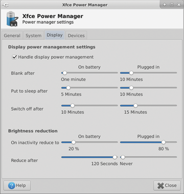
The new configuration dialog can compete well with other systems like Windows or OS X. When Xfce recognizes that it is running on a mobile device, it will indicate a precise setting for operation both with a power supply and a battery (Figure 8). There is an option for specifying an amount of time after which the device will switch into Hibernate or Suspend mode and an option for letting Xfce automatically reduce the screen brightness during battery-powered operation.
 Figure 8: Good for laptops and PCs: The energy settings can be adjusted with noticeably greater precision.
When the battery level becomes critically low, Xfce can switch the computer into sleep mode until the user comes across another electrical outlet. For every occurrence, it is also possible to set a time with minute resolution when the Xfce should respond.
The new dialog for power management in Xfce 4.12 even performs well for a PC that always runs off of a power supply. The PC user typically wants the display to turn off after a specified time so that the computer uses less power. Automatic shutoff can be activated with a mouse click in Xfce. Likewise, the changes made to the task manager that has been ported to Xfce 4.12 on GTK3, look noticeably more elegant. Users who want to find out why the fan is constantly running on a notebook will be able to get this figured out quickly. A search mask makes the job of finding processes with a specific name easier.
Buy this article as PDF
Pages: 6
(incl. VAT)


